This week, I played around with visualizations of data.
I worked with the 2021 Census Profile of the City of Vancouver (Stats Can source below) and explored ways to visually represent the data. I put the raw data into Google Sheets and then produced the visuals.
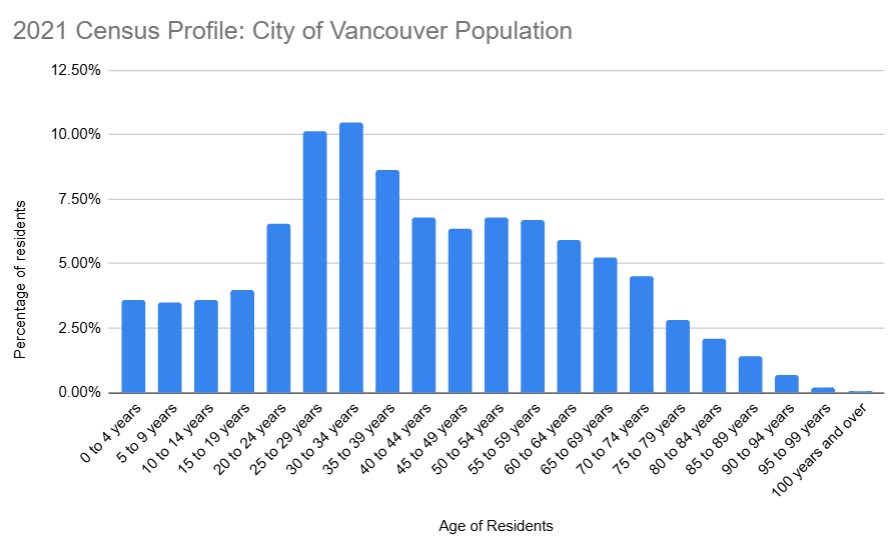
Below is a representation illustrating the various age bands as a percentage of the population. This data is interesting, as I would have not actually known that 30-34 year olds, followed closely by 25-29 year olds, were the largest age groups in the City.
https://www12.statcan.gc.ca/census-recensement/2021/dp-pd/prof/details/page.cfm?Lang=E&SearchText=Vancouver&DGUIDlist=2021A00055915022,2021S051259150477&GENDERlist=1&STATISTIClist=1&HEADERlist=0
I also explored representing the data by absolute numbers of residents.
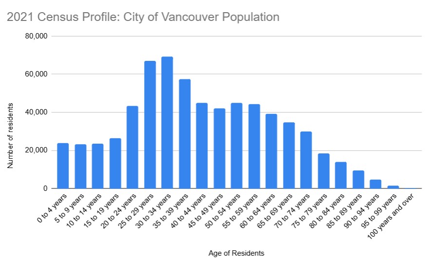
Both of these data visualizations, above, have their uses. I believe that it would be the target audience that would help decide which is more appropriate.
I explored having both the percentage and the absolute number on the same graph. Due to the large number of age bands, it was too cluttered and distracting. It was not in keeping with Mayer’s principles for multimedia learning and I found it created cognitive overload for me.
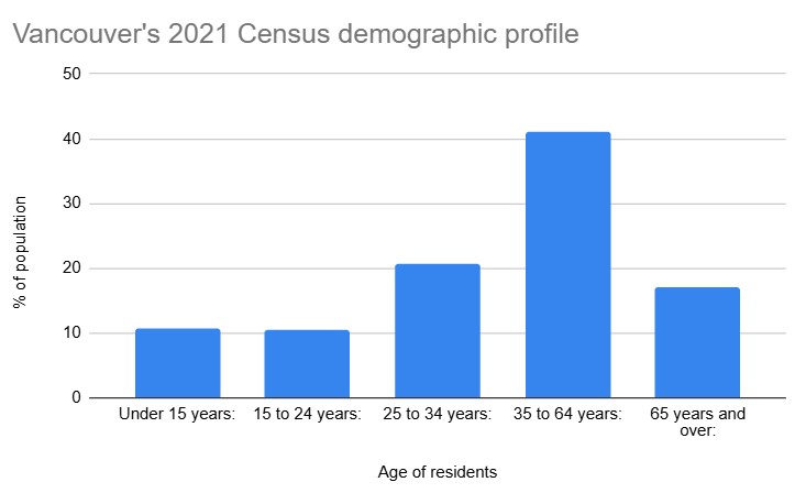
Interestingly, my initial dive into the data produced by Google Gemini was very general and produced age bands that were varied and not consistent in their increments.
The resulting graph, below is misleading and misrepresenting the data, as we discussed in class. It really showed me that an author must understand and be cognizant to ensure that the data is accurate.
Mayer’s multimedia learning principles
My aim with the above is to ensure the data visualizations clear, simple and uncluttered, so as not to overload a reader’s cognitive load as per Mayer’s multimedia learning principles. I used one colour, which I selected to stand out, but not overwhelm. My visuals have easy to understand headings, labeling of data along with horizontal and vertical titles for readers. I selected bar charts as my method of conveying the information as these are easily digested by readers.
Leave a Reply